Wednesday, September 15, 2010

Wordle.net Accents for Your Photos

I love words, always have. I love quotations, and just label type words added to everything from walls to canisters to photos - whatever. I think words add a cool graphic element to nearly anything. That's why I loved Matt Kloskowski's NAPP tutorial that appeared this week on how to generate words on Wordle.net to use with your photo. Matt actually used sport oriented words to "push" a photo through, but I thought the same thing would make a cool background or texture for an image. This morning I tried Wordle.net out for the first time and here's what I made... very simple, but fun:

If you're a member of NAPP you can watch Matt's tutorial on the NAPP website... and if you aren't a member, you can join - just click on the link to the right! Or, you can just do the trial and error method - just go to Wordle.net to generate your words! (Hint - "Print" it out as a .PDF)

BTW, the above image with the words is available on iStockPhoto:
http://www.istockphoto.com/file_closeup.php?id=14119969

Sunday, September 12, 2010

I've been busy editing photos of my favorite model that I shot in August, and I'm finally getting the last of them through the inspection process at iStock. Here is one of my favorites:


Monday, August 23, 2010

HDR Pro Screen Cut Off!

I have been busy adding to my iStockPhoto portfolio, so I haven't posted anything in forever. Tonight I was playing around with Photoshop for fun (non-iStock fun) and wanted to try HDR Pro in CS5 with an image or two I had taken at the beach last week, when I encountered a problem. In case anyone else has encountered this same problem, I thought I'd post able it so there was one more place on the web with a solution.

I'm running CS5 on a less than one year old MacBook Pro, with the latest OS at this writing (10.6.4). I selected my images in Bridge and chose "Merge to HDR Pro" to process them (under: Tools > Photoshop). When I got to the HDR Pro dialog I noticed that my thumbnails of the various exposures were not completely visible at the bottom of the screen. Worse yet, the buttons to continue or cancel where not there! I was stuff in HDR Pro and couldn't get out. Force Quit was not an available option shown, so I had to Force Quit HDR Pro by doing COMMAND - SHIFT - ESC.

I began to research the problem on the web and found a couple suggested solutions on the Adobe Forum. One was to move the Dock to the side... after quitting Bridge, I moved the Dock to the left and that worked - I could now see the buttons in HDR Pro. Another option suggested was to delete the Photoshop CS5 Preferences file and rebuild it by starting up without one. Tried that... didn't work. Finally I found a Tech Note on the Adobe site:
http://kb2.adobe.com/cps/843/cpsid_84349.html
This said to turn "Hiding On" for the Dock if you have it on the bottom... Voila! That worked and was a quick and easy fix. I still see this as a bug Adobe should fix, but turning hiding ON or OFF by right clicking on the Dock size adjustment slider it easy enough, so I'll go with that whenever I want to play with HDR Pro.

So, not a masterpiece by any means, but this is my first play with HDR... I basically used the Surrealistic preset for this... thought it looked kinda spooky but cool!


Thursday, April 22, 2010

CS5 Coming Soon!

Well, I called Adobe and ordered my upgrade to Photoshop CS5 yesterday! I can't wait! They said it will be shipping on April 30th.

There are so many improvements from CS4 to CS5 that I just had to have the latest and greatest. Since I started to do stock photography for iStockPhoto, the greatly improved noise reduction is one of the features I'm most excited about. But... after watching so many videos and podcasts on HDR, I would like to play with that! I view the addition of HDR Pro purely as a toy for myself, but since Photomatix is $99 and my upgrade to CS5 is costing me $159 with my NAPP discount, I can argue that the HDR Pro almost covers most of the cost of the upgrade to CS5. Then there is the Content Aware Fill (SO COOL), and Mini Bridge is CUTE! And the new improved selection tool... well that is sure to come in handy when my daughter and son's hair is sticking up and I'm trying to isolate them on a white background! There are lots of other little improvements to CS5 from Adobe's JDI (Just Do It) initiative too numerous to mention! I've never been so excited about a piece of software... well, at least not since I got my first real Photoshop (not Elements) last November!

If you'd like to know more about the improvements and additions to Photoshop in CS5, I highly recommend http://www.photoshopuser.com/cs5.

If you have CS2 or later you can upgrade to CS5. AND, if you'd like to save 20% on your upgrade cost, just join NAPP before upgrading and then give Adobe a call with your NAPP member number in hand. Join NAPP here! The discount on your upgrade saves you at least $40 - covering nearly half of your NAPP membership fee - and there are so many other discounts and other great benefits to joining NAPP - you won't be sorry you did!

Friday, February 26, 2010

Stepping into Stock

Well, I haven't posted anything in forever... so I thought I'd just give a update on one of the things I've been doing photography wise.

I learned of stock photography at one of the first get togethers of the Shutterbug Excursions that I attended... I didn't even know that such thing existed. The thought of taking photos that could possibly earn me a few dollars without any pressure to perform (i.e. doing portraits) really appeals to me, so I became to pursue the stock photography route. Being a total neophyte to the stock photography business I applied to the biggest and most well known on-line stock photography agency, iStockPhoto. Well, that was a rocky ride for a long while! It took me several months to get approved as a contributor. After finally being approved, then came the roller coaster ride of elation and frustration every time I got an email with the subject line either "iStockphoto: acceptance notice for file #12124..." or "iStockphoto: Notice for File #12102...". When it doesn't say "acceptance" as the second word - it isn't good news! I'm happy to say that six months after my first photo was accepted into the iStock collection, that roller coaster has smoothed out considerably. I now have over 100 files accepted to the iStock collection and over 60 downloads. I still have a lot of learning and room for improvement - but there is hope!

If you would like to learn more about the stock photography business, Yuri Arcurs blog (http://www.arcurs.com/microstock-agencies-an-overview-for-beginners) is an excellent resource. I wish I would have found it back in April of 2009 instead of just a week ago! Also, check out his YouTube video of his studio! It's AWESOME! (http://www.youtube.com/watch?v=VYkNKP96b84)

If you'd like to see my iStockPhoto portfolio, you'll find it here: http://www.istockphoto.com/1morephoto


Tuesday, August 18, 2009

Building a Lightbox with PVC Pipe

A while back I was admiring some photos on Flickr by MissMae, particularly this one. MissMae was kind enough to tell me about her lightbox she had built using PVC pipe and white fabric, so I decided to build my own. Off to Lowe's I went, and purchased the following:

2 - 10' lengths of 1/2" PVC pipe (Lowe's Item # 23987)
8 - three way elbows (not shown on Lowe's website - sorry)
8 - threaded fittings (not shown on Lowe's website - sorry)


The three way elbow thingys had one hole threaded, hence the need for the threaded fittings.

Then off to Wal-Mart for 2 yards white fabric and 2 clap-on gooseneck lamps and some 100 watt CFL's. The pipe was cheap, but the fittings brought the total at Lowe's to around $14. The fabric was about $4 and the lights were about $10 each. Not counting the light bulbs, I'd spent roughly $38.

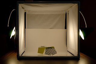
I cut the PVC pipe into 12 - 20" lenghts and assembled the box, which ends up about 24" square with the fittings. I cut the 42" wide fabric in half to make two 21" wide strips, each 72" long. One piece I cut to about 52" to span two sides of the box and allow for rod pockets on each end (similar to a rod pocket on a curtain). The other piece of fabric I left at the full 72" length and sewed pockets on each end of both strips. I pulled the pipe and fitting apart on one end and threaded the pipe through the pocket, wrapped the fabric around the box and threaded the other pocket. Likewise for both pieces of fabric. This leaves one side open for photographing. I clap the lights on to the pipe over the fabric wherever the mood strikes me, and use a piece of poster board curved along the floor and back of the box for my seamless background. I was also lucky enough to have a piece of white plexiglass laying around, so I often use that on the bottom to provide a bit of reflection and make for easy cleaning. Here's what it looks like:


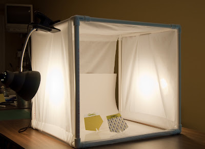
I probably should have turned more lights on when I took these pictures, but I was trying to hid the junk piled on the table in the background. LOL!

I did not glue the pipe together; it fits tightly and is sturdy without. This way I can disassemble my box and store it away (although that hasn't happened yet! LOL!) and also it allows for easy modification. Although I have about $38 in this light box, and I could have bought one at Adorama for just a bit more, I like mine. This a bit bigger, washable, modifiable, and it was fun to build.


I've had pretty good results from it, although I still have lots to learn. Below you can see one of my favorite subjects photographed in my lightbox:


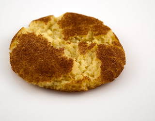
Snickerdoodle - Yum!

Thursday, March 5, 2009

It Pays to Play

I learned something today! It pays to play with those buttons and dials on your camera! I'm so glad I did! Here's what I was doing and what I learned about:

After visiting the Philadelphia Flower Show on Tuesday and getting some beautiful roses for a steal (25 for $9.95) I decided to try to get one of those dramatic shot of a rose with a black background. I hung a black cloth and placed a single rose on our bar directly underneath a small halogen spotlight (my new favorite place for shooting indoor still lifes). I put my camera on Aperture Priority, no flash, and took a few photos. This first photo is what I got:


Not exactly what I was aiming for AT ALL! Looks like a ball of cotton still on the plant - no, even that would have more contrast and definition! And, I don't like that I can see the wrinkles in my black fabric background. Do I need to get the iron out? Hmmm...

I just got my Nikon D90 in November, and I know it is a good camera, so there must be something I can do to get a better shot of this rose. So, I decided to play around with some of the settings that I haven't touched yet, namely the metering.
So, I changed the metering from the default of Matrix or Pattern metering to spot metering... a new frontier for me. I took another shot and it came out a bit better (second photo).
It has a little bit of petal detail, but I'm not going to win any photo contests with this. Heck, I'm still not going get a print or even show it to anyone, but I'm heading in the right direction.


Now, what else can I do? Oh, maybe I'll try tinkering with the Exposure Compensation... I never did that either... I know where the button is, and that I need to press and hold it down while rotating one of the two dials. Okay, let's see...

Here's my first attempt at adjusting the Exposure Compensation.
I continued to use the spot metering and set the EV at -0.7.
Now it was starting to look more like I envisioned. Okay, let's see what happens if I reduce the exposure even more... this is fun now instead of frustrating!


This shot was taken with the Exposure set at -1.7. Now I can really see some petals...
Oh, I can see a little something on the left edge too. I'll have to crop this one if I decide to use it for anything. I didn't do any post-processing on any of these shots in this blog entry, since I merely wanted to document what changes in the metering and exposure did straight out of my camera.
Now, I think I'll try one more... let's get crazy and really decrease the exposure...


This final photo I took using an Exposure Value of -3.0. It may be a bit too dark for some, but I like it. I like the way the stem fades into darkness. Very dramatic. It reminds me of those great covers on the Twilight series books.

So, I learned today that the best way to learn is to play. Now I have to get some WORK done... Darn!